
1. Sass
Sass는 CSS pre-processor 로서, 복잡한 작업을 쉽게 할 수 있게 해주고, 코드의 재활용성을 높여줄 뿐만 아니라, 코드의 가독성을 높여주어 유지보수를 쉽게 해준다.
⭐ Sass 가이드 참고
Sass에서는 .scss 와 .sass 두 가지의 확장자를 지원한다.
Sass 가 처음 나왔을 땐 sass 만 지원됐었는데 .sass 는 중괄호를 쓰지 않고 들여쓰기를 쓰고, 세미콜론을 쓰지 않는 형태도 있었기 때문에 개발자들이 헷갈려하자 .scss 라는 확장자를 만들어서 이점을 보완하여 css 문법과 유사하게 작성할 수 있도록 되었다. 따라서 Sass 로 스타일링을 한다고 하면 .scss 확장자를 많이 이용한다.
.sass
$font-stack:    Helvetica, sans-serif
$primary-color: #333

body
  font: 100% $font-stack
  color: $primary-color
.scss
$font-stack:    Helvetica, sans-serif;
$primary-color: #333;

body {
  font: 100% $font-stack;
  color: $primary-color;
}
시작하기
리액트 프로젝트를 생성하고, 해당 리액트 프로젝트 디렉터리에 node-sass 라이브러리를 설치한다.
$ npx create-react-app styling-wiht-sass
$ cd styling-with-sass
$ yarn add node-sass
** node-sass
Sass 를 CSS로 변환해주는 라이브러리
스타일링
components/Button.js
import React from 'react';
import './Button.scss';

function Button({ children }) {
  return <button className="Button">{children}</button>;
}

export default Button;
components/Button.scss
$blue: #228be6; // 변수 선언

.Button {
  display: inline-flex;
  color: white;
  font-weight: bold;
  outline: none;
  border-radius: 4px;
  border: none;
  cursor: pointer;

  height: 2.25rem;
  padding-left: 1rem;
  padding-right: 1rem;
  font-size: 1rem;

  background: $blue; // 주석 사용
  &:hover {
    background: lighten($blue, 10%); // 색상 10% 밝게
  }

  &:active {
    background: darken($blue, 10%); // 색상 10% 어둡게
  }
}
버튼을 App 컴포넌트에서 렌더링 해보자.
App.js
import React from 'react';
import './App.scss';
import Button from './components/Button';

function App() {
  return (
    <div className="App">
      <div className="buttons">
        <Button>BUTTON</Button>
      </div>
    </div>
  );
}

export default App;
className 동적으로 설정하기
className={['Button', size].join(' ')}className={`Button ${size}`}하지만 조건부로 CSS 클래스를 넣어주고 싶을 때는 이렇게 문자열을 직접 조합해주는 것 보다 classnames 라는 라이브러리를 사용하는 것이 훨씬 편리하다.
classNames('foo', 'bar'); // => 'foo bar'
classNames('foo', { bar: true }); // => 'foo bar'
classNames({ 'foo-bar': true }); // => 'foo-bar'
classNames({ 'foo-bar': false }); // => ''
classNames({ foo: true }, { bar: true }); // => 'foo bar'
classNames({ foo: true, bar: true }); // => 'foo bar'
classNames(['foo', 'bar']); // => 'foo bar'

// 동시에 여러개의 타입으로 받아올 수 도 있습니다.
classNames('foo', { bar: true, duck: false }, 'baz', { quux: true }); // => 'foo bar baz quux'

// false, null, 0, undefined 는 무시됩니다.
classNames(null, false, 'bar', undefined, 0, 1, { baz: null }, ''); // => 'bar 1'
function Button({ children, size, color, outline }) {
return (
<button className={classNames('Button', size, color, { outline })}>
{children}
</button>
);
}이런 식으로 outline 과 같이 props로 받아와서 객체 안에 집어 넣은 다음에 classNames() 에 포함시키면 outline 값이 true 일 때만 button 에 outline CSS 클래스가 적용되게 할 수도 있다.
classnames 라이브러리 설치
$ yarn add classnamesclassnames 사용법
import React from 'react';
import classNames from 'classnames';
import './Button.scss';

function Button({ children, size }) {
  return <button className={classNames('Button', size)}>{children}</button>;
}

Button.defaultProps = {
  size: 'medium'
};

export default Button;
재사용기능 mixin
반복되는 코드가 있다면 Sass의 mixin 이라는 기능을 사용하여 쉽게 재사용할 수 있다.
@mixin 을 통해 재사용할 코드의 변수명과 코드를 작성해준다. (마치 함수처럼 사용된다.)
@mixin button-color($color) {
  background: $color;
  &:hover {
    background: lighten($color, 10%);
  }
  &:active {
    background: darken($color, 10%);
  }
}
선언해준 mixin은 @include 라는 키워드를 통해서 사용할 수 있다.
@include button-color($blue);
예시)
$blue: #228be6;
$gray: #495057;
$pink: #f06595;

@mixin button-color($color) {
  background: $color;
  &:hover {
    background: lighten($color, 10%);
  }
  &:active {
    background: darken($color, 10%);
  }
}

.Button {
  display: inline-flex;
  color: white;
  font-weight: bold;
  outline: none;
  border-radius: 4px;
  border: none;
  cursor: pointer;

  // 사이즈 관리
  &.large {
    height: 3rem;
    padding-left: 1rem;
    padding-right: 1rem;
    font-size: 1.25rem;
  }

  &.medium {
    height: 2.25rem;
    padding-left: 1rem;
    padding-right: 1rem;
    font-size: 1rem;
  }

  &.small {
    height: 1.75rem;
    font-size: 0.875rem;
    padding-left: 1rem;
    padding-right: 1rem;
  }

  // 색상 관리
  &.blue {
    @include button-color($blue);
  }

  &.gray {
    @include button-color($gray);
  }

  &.pink {
    @include button-color($pink);
  }

  & + & {
    margin-left: 1rem;
  }
}
2. CSS Module
리액트 프로젝트에서 컴포넌트를 스타일링 할 때 CSS Module 이라는 기술을 사용하면, CSS 클래스가 중첩되는 것을 완벽히 방지할 수 있다.
CRA로 만든 프로젝트에서 CSS Module 을 사용할 때에는 CSS 파일의 확장자를 .module.css 로 하면 된다.
Box.module.css
.Box {
  background: black;
  color: white;
  padding: 2rem;
}
Box.js
import React from "react";
import styles from "./Box.module.css"; // css 모듈 불러옴

function Box() {
  return <div className={styles.Box}>{styles.Box}</div>;
}

export default Box;
이런식으로 CSS Module 을 사용하면 리액트 컴포넌트에서 해당 CSS 파일을 불러올 때 CSS 파일에 선언한 클래스 이름들이 모두 고유해진다.
고유 CSS 클래스 이름이 만들어지는 과정에서는 파일 경로, 파일 이름, 클래스 이름, 해쉬값 등이 사용될 수 있다.
그리고 classNames 를 설정할 때는 styles.box 처럼 import 로 불러온 styles 객체 안에 있는 값을 참조해야 한다.
클래스 이름에 대하여 고유한 이름들이 만들어지기 때문에 실수로 CSS 클래스 이름이 다른 관계 없는 곳에서 사용한 CSS 클래스 이름과 중복되는 일에 대하여 걱정할 필요가 없다.
이 기술은 다음과 같은 상황에 사용하면 유용하다.
- 레거시 프로젝트에 리액트를 도입할 때 (기존 프로젝트에 있던 CSS 클래스와 이름이 중복되어도 스타일이 꼬이지 않게 해준다.)
- CSS 클래스를 중복되지 않게 작성하기 위하여 CSS 클래스 네이밍 규칙을 만들기 귀찮을 때
리액트 컴포넌트를 위한 클래스를 작성할 때 자주 사용되는 CSS 클래스 네이밍 규칙은 다음과 같다.
- 컴포넌트의 이름은 다른 컴포넌트랑 중복되지 않게 한다.
- 컴포넌트의 최상단 CSS 클래스는 컴포넌트의 이름과 일치 시킨다. (예:
.Button) - 컴포넌트 내부에서 보여지는 CSS 클래스는 CSS Selector 를 잘 활용한다. (예:
.MyForm.my-input)
이처럼 만약 CSS 클래스 네이밍 규칙을 만들고 따르기 싫다면, CSS Module 을 사용하면 좋다.
classnames 라이브러리 활용
이처럼 CSS Module을 사용할 때에는 styles.icon 이런 식으로 객체 안에 있는 값을 조회해야 한다.
만약 클래스 이름에 - 가 들어 있다면 styles['my-class'] 처럼 사용해주어야 한다.
또한 클래스가 여러개가 된다면 ${styles.one} ${styles.two} 처럼 작성해주어야 하기 때문에 번거로워진다.
이때 Sass에서 사용했던 classnames 를 css module 에도 적용할 수 있는데, classname 라이브러리의 bind 기능을 이용해준다.
classnames 라이브러리를 설치해준 뒤, 다음과 같이 불러와서 사용할 수 있다.
import React from 'react';
import { MdCheckBox, MdCheckBoxOutlineBlank } from 'react-icons/md';
import styles from './CheckBox.module.css'; // 불러온 styles를 bind() 안에 넣어준다.
import classNames from 'classnames/bind';

const cx = classNames.bind(styles); // classnames.bind 이용

function CheckBox({ children, checked, ...rest }) {
  return (
    <div className={cx('checkbox')}>
      <label>
        <input type="checkbox" checked={checked} {...rest} />
        <div className={cx('icon')}>
          {checked ? (
            <MdCheckBox className={cx('checked')} />
          ) : (
            <MdCheckBoxOutlineBlank />
          )}
        </div>
      </label>
      <span>{children}</span>
    </div>
  );
}

export default CheckBox;
classnames 의 bind 기능을 사용하면, CSS 클래스 이름을 지정해줄 때 cx('클래스이름') 과 같은 형식으로 편하게 사용할 수 있다.
여러개의 CSS 클래스를 사용해야하거나, 조건부 스타일링을 해야하는 경우 사용하면 좋다.
cx('one', 'two')
cx('my-component', {
  condition: true
})
cx('my-component', ['another', 'classnames'])
Sass에서 CSS Module 사용하기
CSS Module 은 Sass에서도 사용할 수 있다. node-sass 를 설치해주고, 그냥 확장자를 .module.scss 로 바꿔주면 된다.
전역적 클래스로 사용하기
그리고, CSS Module을 사용하고 있는 파일에서 클래스 이름을 고유화하지 않고 전역적 클래스 이름을 사용하고 싶다면 다음과 같이 작성하면 된다.
:global .my-global-name {

}
Sass 에서 적용한다면 다음과 같이 할 수 있다.
:global {
  .my-global-name {

  }
}
특정 클래스에서만 고유 이름 사용하기
반대로, CSS Module을 사용하지 않는 곳에서 특정 클래스에서만 고유 이름을 만들어서 사용하고 싶다면 다음과 같이 할 수 있다.
:local .make-this-local {

}
Sass
:local {
  .make-this-local {

  }
}
3. styled-components
styled-components 는 Tagged Template Literal 이라는 문법을 이해하면 styled-components 가 내부적으로 어떻게 작동하는지 이해할 수 있다. (참고)
⭐ VSCode 추천 확장팩: vscode-styled-component / 색상 기능 및 자동완성 지원
설치하기
$ yarn add styled-components
사용법
import React from 'react';
import styled from 'styled-components';

const Circle = styled.div`
  width: 5rem;
  height: 5rem;
  background: black;
  border-radius: 50%;
`;

function App() {
  return <Circle />;
}

export default App;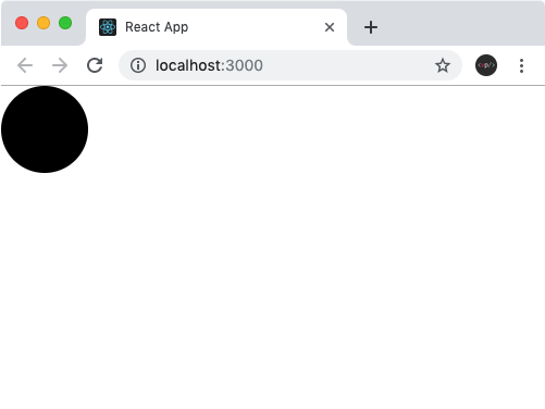
styled-components 를 사용하면 이렇게 스타일을 입력함과 동시에 해당 스타일을 가진 컴포넌트를 만들 수 있다.
만약에 div 를 스타일링 하고 싶으면 styled.div` `, input 을 스타일링 하고 싶으면 styled.input` ` 이런식으로 사용하면 된다.
props 값 설정하기
props 값을 설정해주었으면 해당 값을 배경색으로 설정하고, 그렇지 않으면 검정색을 배경색으로 사용하도록 설정하였다.
import React from 'react';
import styled from 'styled-components';

const Circle = styled.div`
  width: 5rem;
  height: 5rem;
  background: ${props => props.color || 'black'};
  border-radius: 50%;
`;

function App() {
  return <Circle color="blue" />;
}

export default App;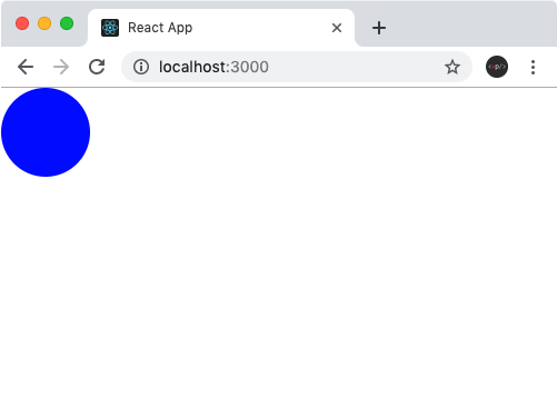
조건부 코드에서 props 조회하기
만약 여러 줄의 CSS 코드를 조건부로 보여주고 싶다면 css 를 사용해야 한다.
css 를 불러와서 사용을 해야 그 스타일 내부에서도 다른 props 를 조회할 수 있게 된다.
import React from 'react';
import styled, { css } from 'styled-components';

const Circle = styled.div`
  width: 5rem;
  height: 5rem;
  background: ${props => props.color || 'black'};
  border-radius: 50%;
  ${props =>
    props.huge &&
    css`
      width: 10rem;
      height: 10rem;
    `}
`;

function App() {
  return <Circle color="red" huge />;
}

export default App;
예시
Button.js
import React from 'react';
import styled from 'styled-components';

const StyledButton = styled.button`
  /* 공통 스타일 */
  display: inline-flex;
  outline: none;
  border: none;
  border-radius: 4px;
  color: white;
  font-weight: bold;
  cursor: pointer;
  padding-left: 1rem;
  padding-right: 1rem;

  /* 크기 */
  height: 2.25rem;
  font-size: 1rem;

  /* 색상 */
  background: #228be6;
  &:hover {
    background: #339af0;
  }
  &:active {
    background: #1c7ed6;
  }

  /* 기타 */
  & + & {
    margin-left: 1rem;
  }
`;

function Button({ children, ...rest }) {
  return <StyledButton {...rest}>{children}</StyledButton>;
}

export default Button;